Prepare Data for Centroid and Raster Maps in 23degrees
In this tutorial, we want to show you how to prepare your datasets to create centroid or raster maps. The goal here is to make sure your dataset has everything it needs to be turned into beautifully colored maps.
In today’s example, we’re using a dataset showing the largest religious group in Germany, based on 10 by 10 kilometer raster cells. Let’s take a closer look at how this dataset is structured
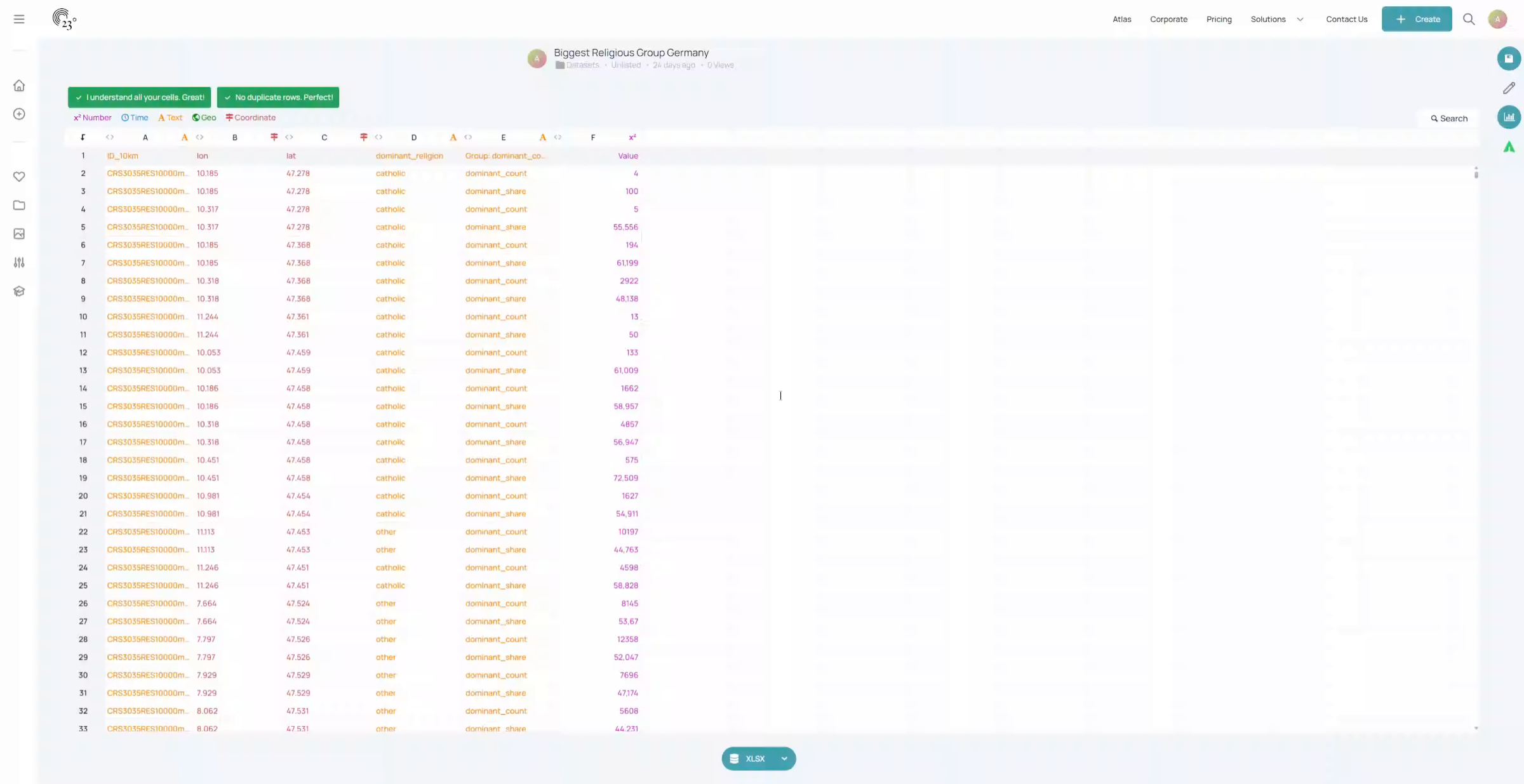
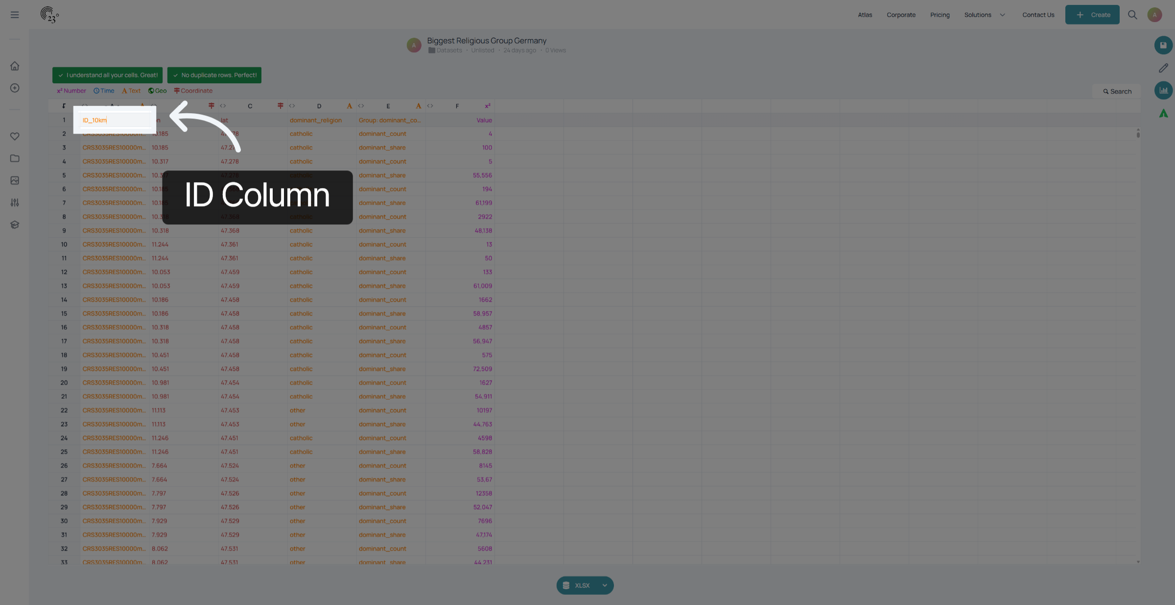
The first important column is the ID column. This column ensures uniqueness across all points in the dataset and makes each point identifiable.
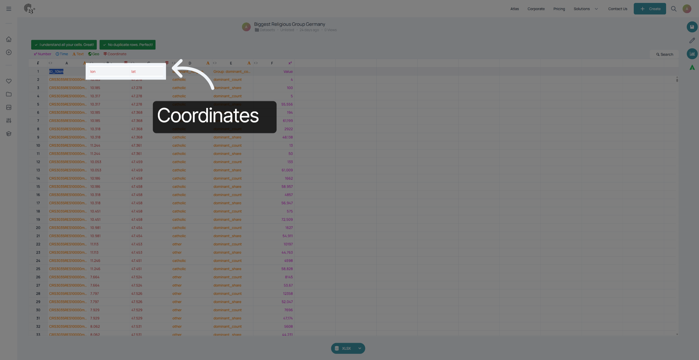
Next, we have the coordinate columns. Without these, it’s not possible to locate the points on the map. Please make sure your data is in WGS84, also known as the Mercator projection.
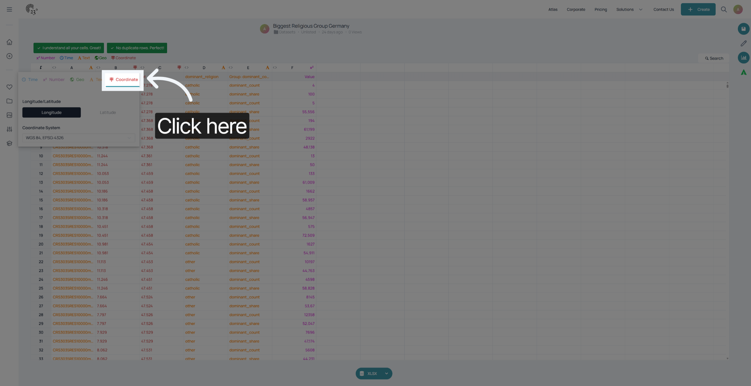
To assign the correct longitude and latitude to each column, you can click on the small sign icon.
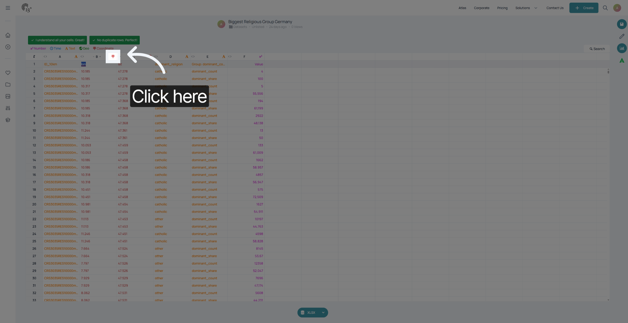
Here, you can correctly assign which column represents longitude and which represents latitude. If you’re unsure, here’s a quick tip: Longitude values range from -180° (west) to +180° (east), with the zero meridian running through Greenwich, London.Latitude values range from -90° (south) to +90° (north) from the equator.
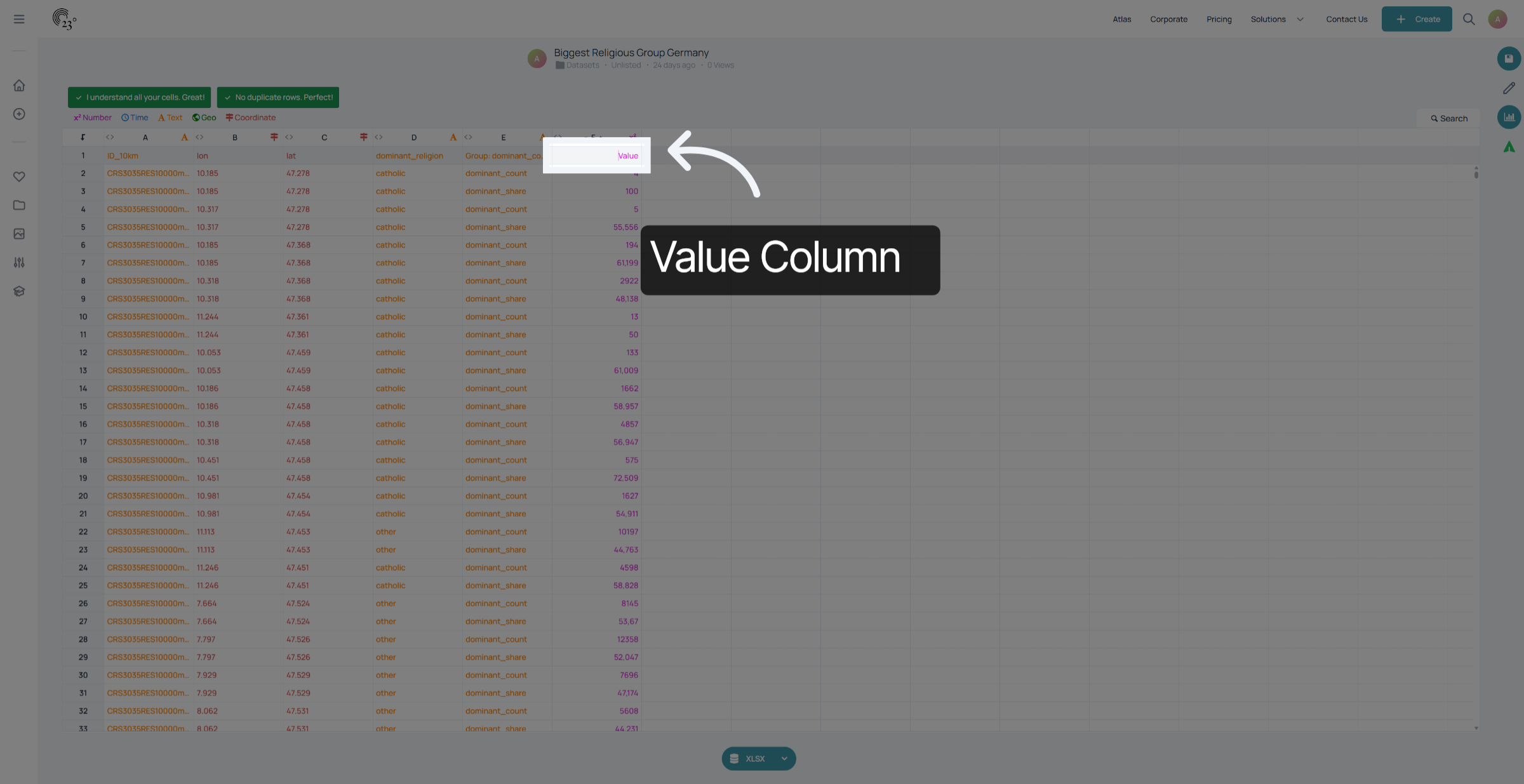
After assigning the correct longitudes and latitudes, the next step is to look at the value column. In this case, it shows the count and share of the dominant religion in Germany.
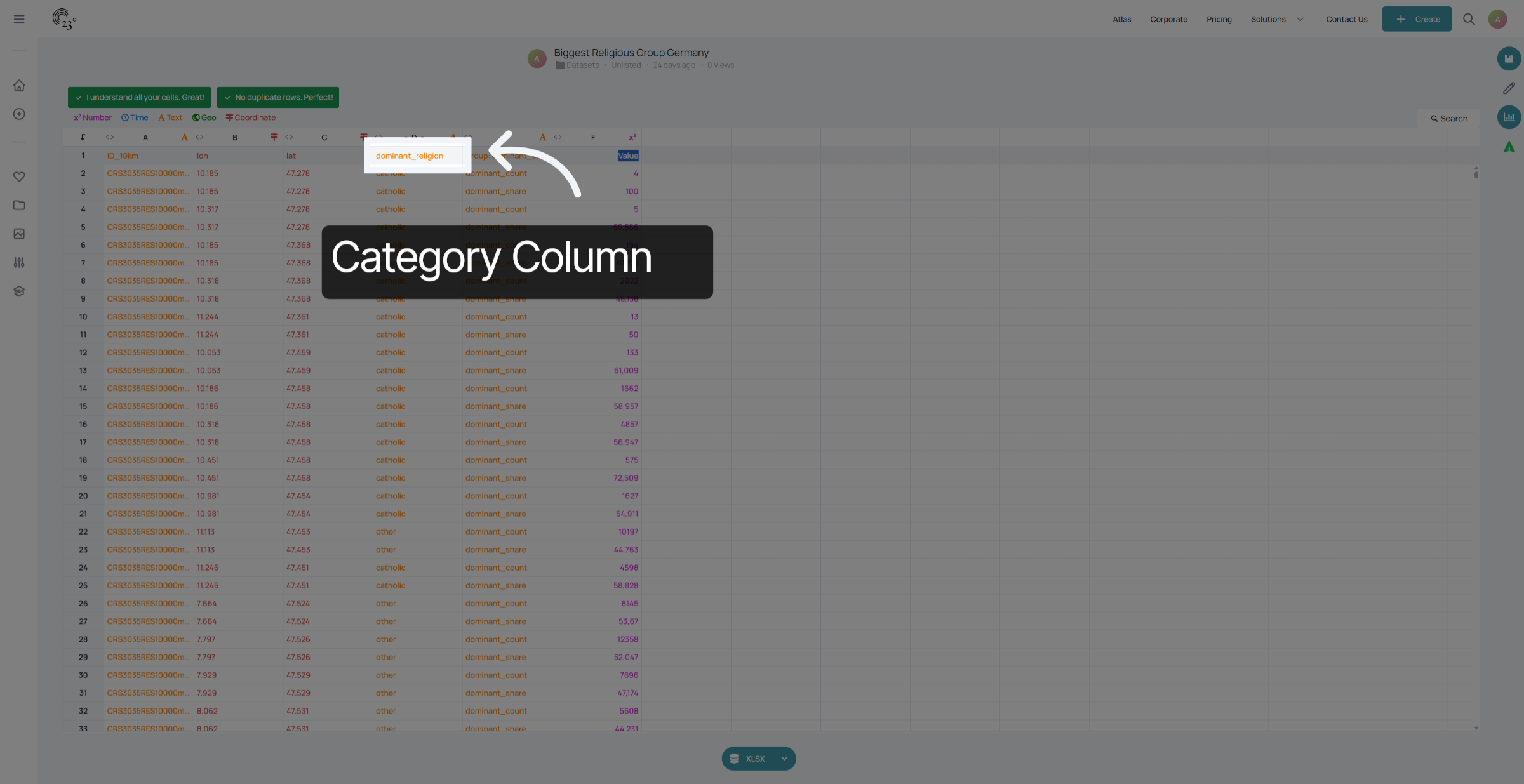
To color the map correctly, we also need a category column. This column defines how the cells are colored. n our example, it’s the name of the largest religious group.
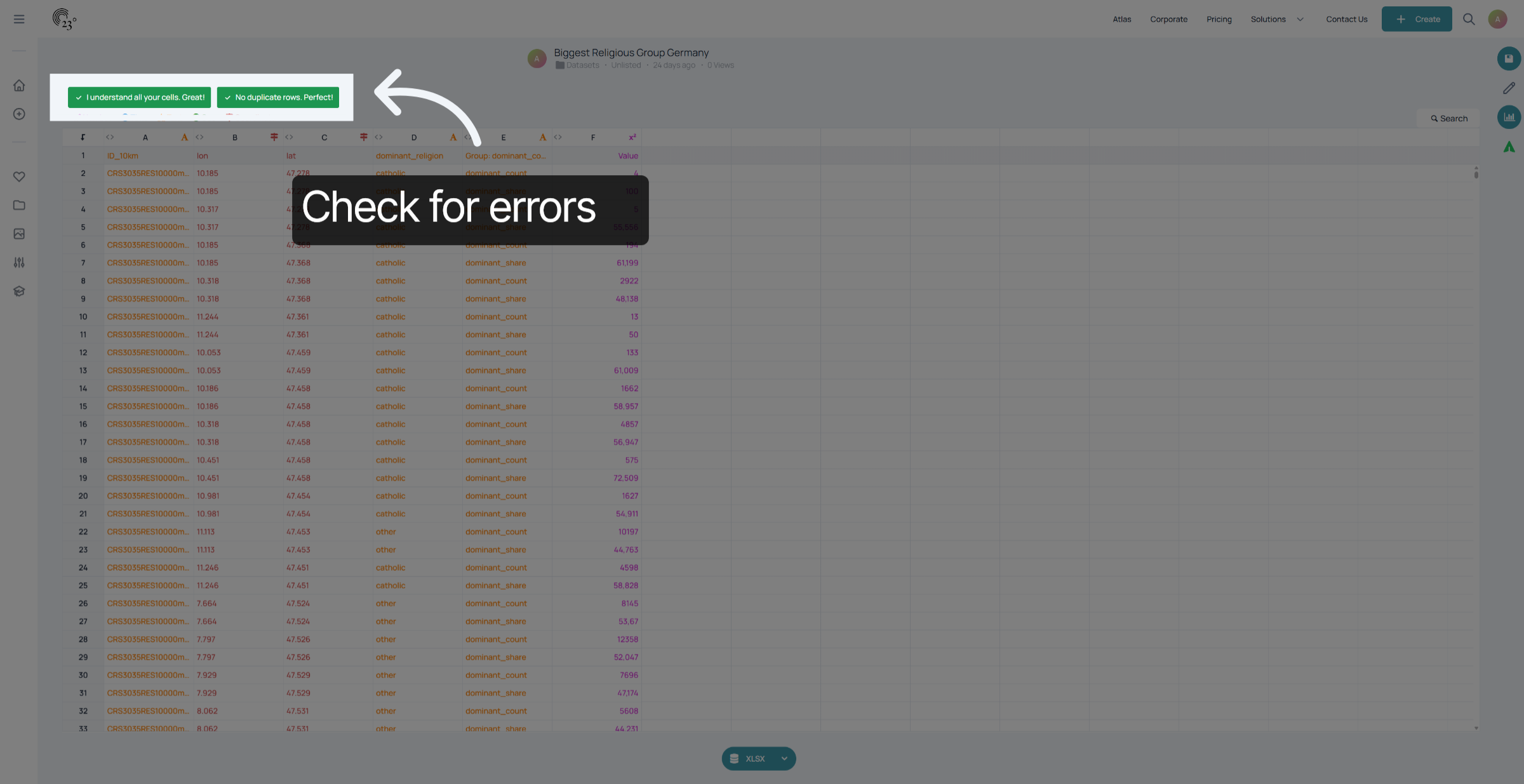
And that’s about it! Just make sure all cells are properly recognized, there are no duplicates, and each ID is unique.
Now you know everything you need to create raster or centroid-based maps. In the next tutorial, we’ll turn this dataset into a beautiful map visualization.