Change Column Type From Text To Geo In 23degrees
This tutorial demonstrates how to change a column's data type from text to geographic format within the 23degrees application.
To change the column type go to the data editor of your visualisation. In this example we have a bar chart showing the population of german speaking countries in Europe. To be able to also create a map from this dataset we need to change the country labels from text to geography.
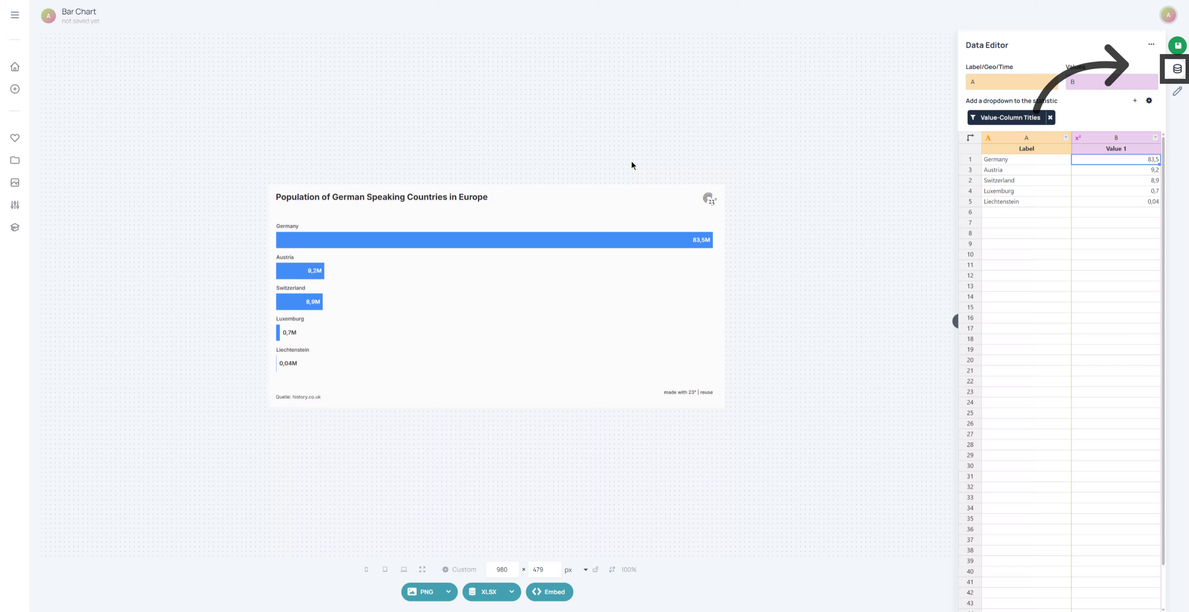
Select the column you wish to change by clicking on the column type icon.
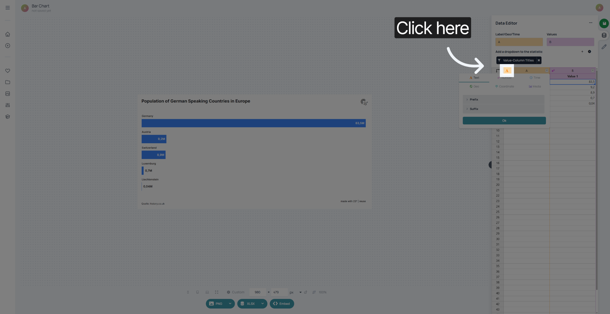
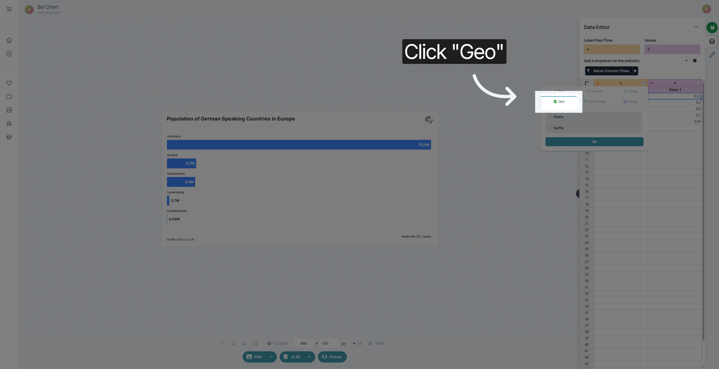
Select "Geo".
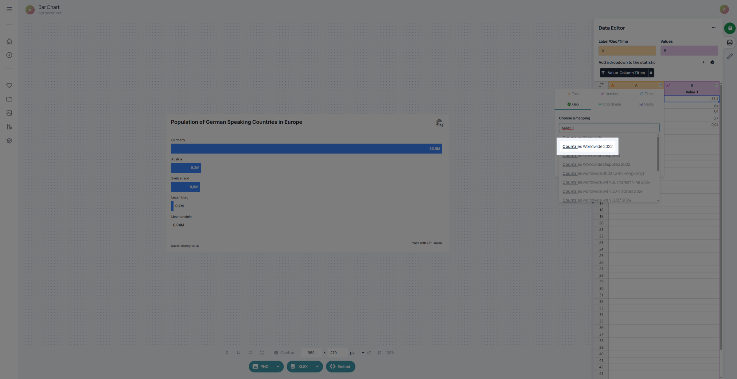
Select a mapping. 23degrees offers hunders of different mapping options from worldwide layers to specific election districts on the lowest administrative levels. In this case we need a layer depicting countries.
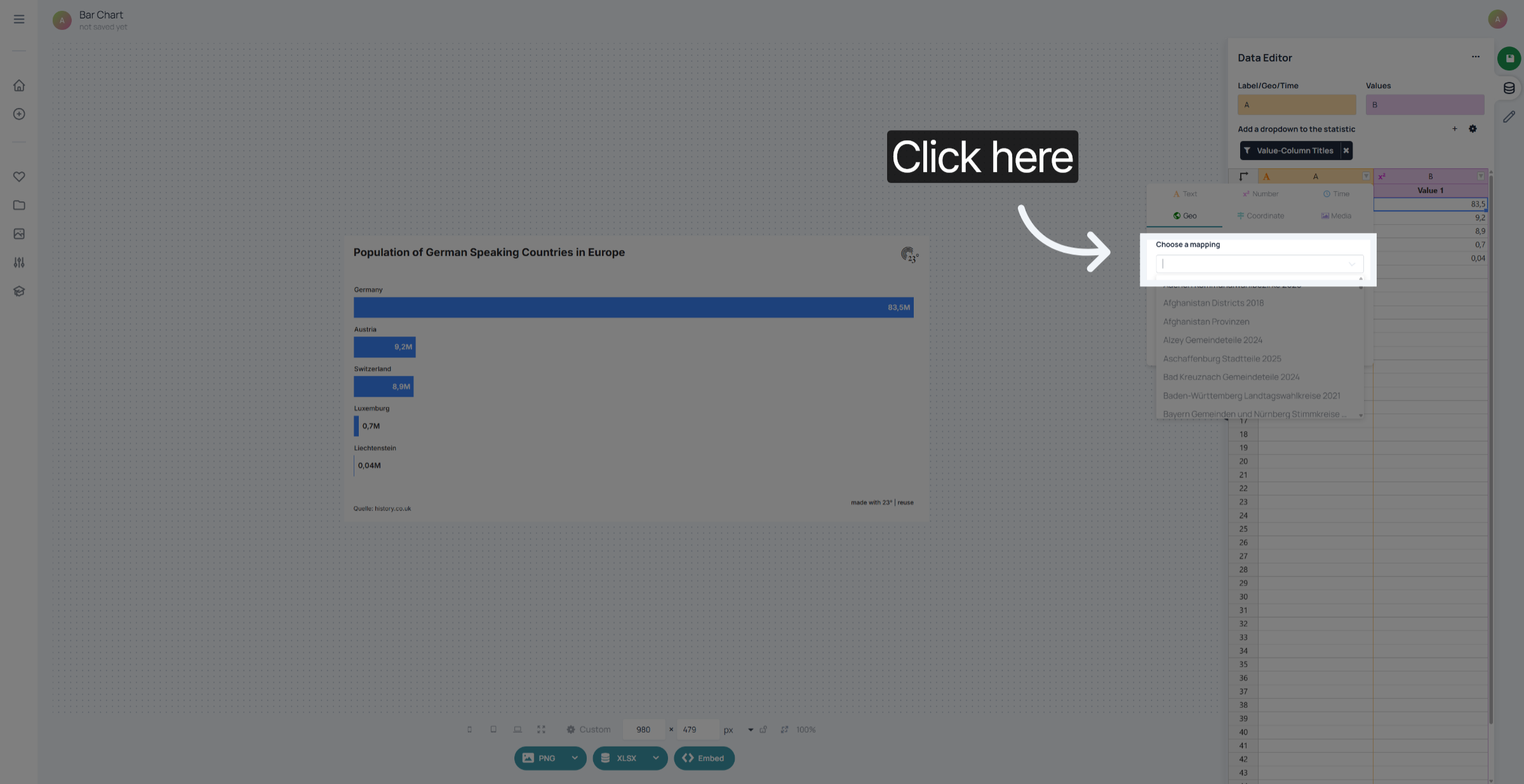
Select the appropriate geographic layer. In 23degrees "Countries Worldwide" is the standard layer for worldwide countries.
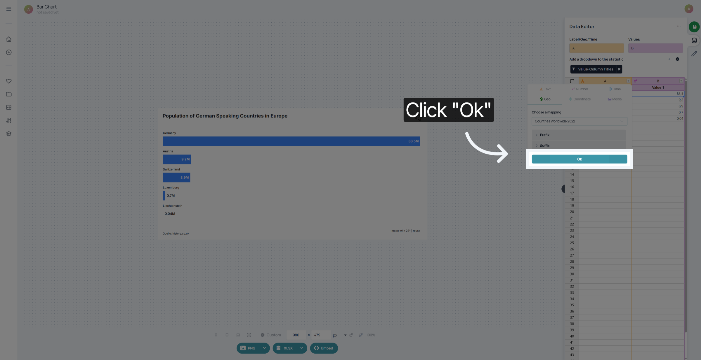
Click "Ok" to confirm the selection.
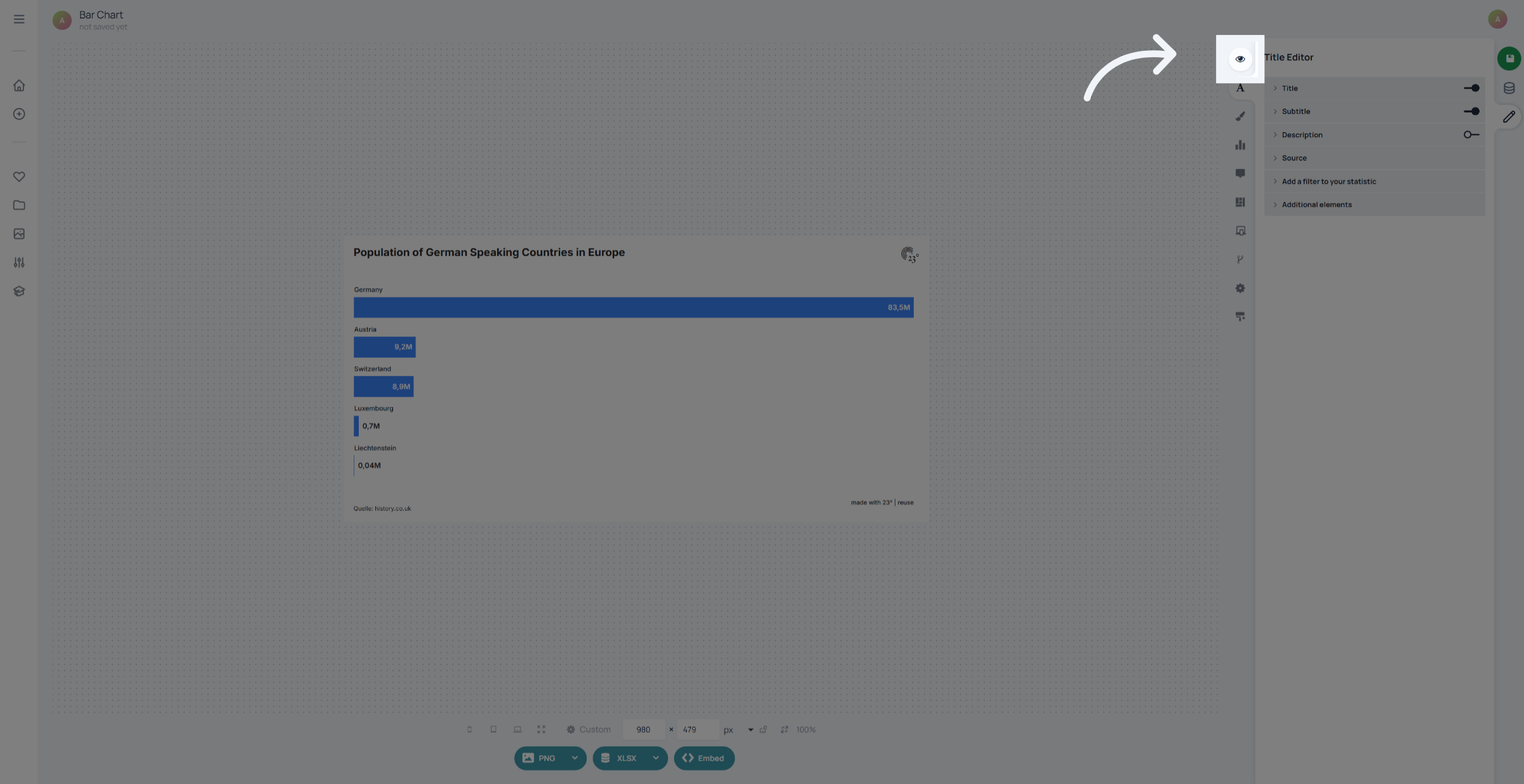
Now go to the General Chart Editor
and switch to map.
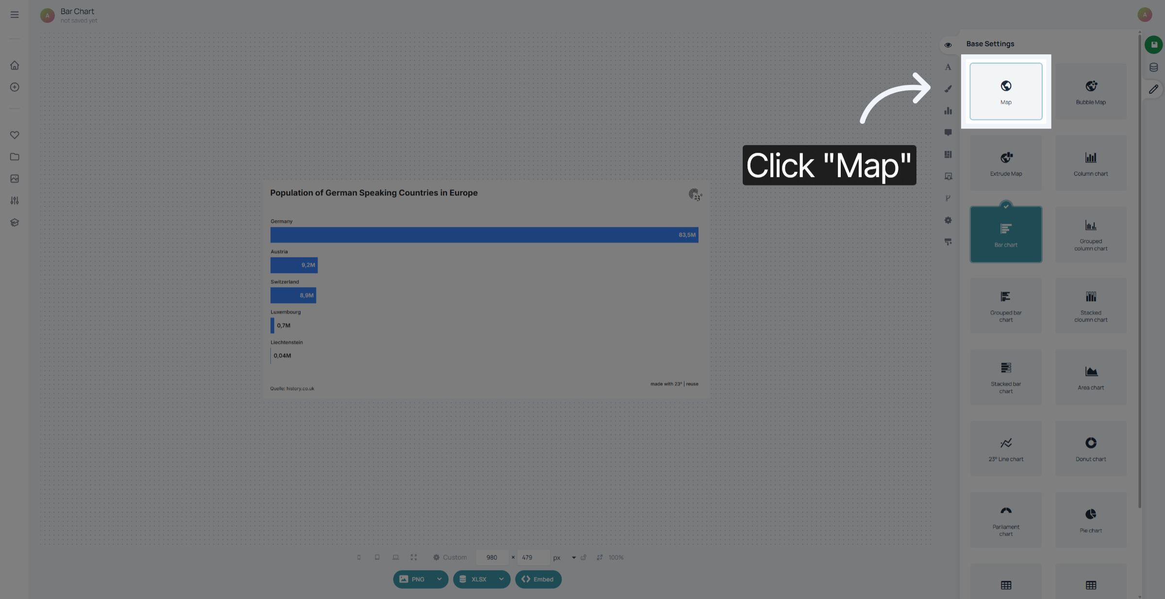
Now your original Bar chart can also be displayed as a map. Keep in mind: You can use the geo type in other chart types as well. They work just like text labels if there is nothing to be mapped.
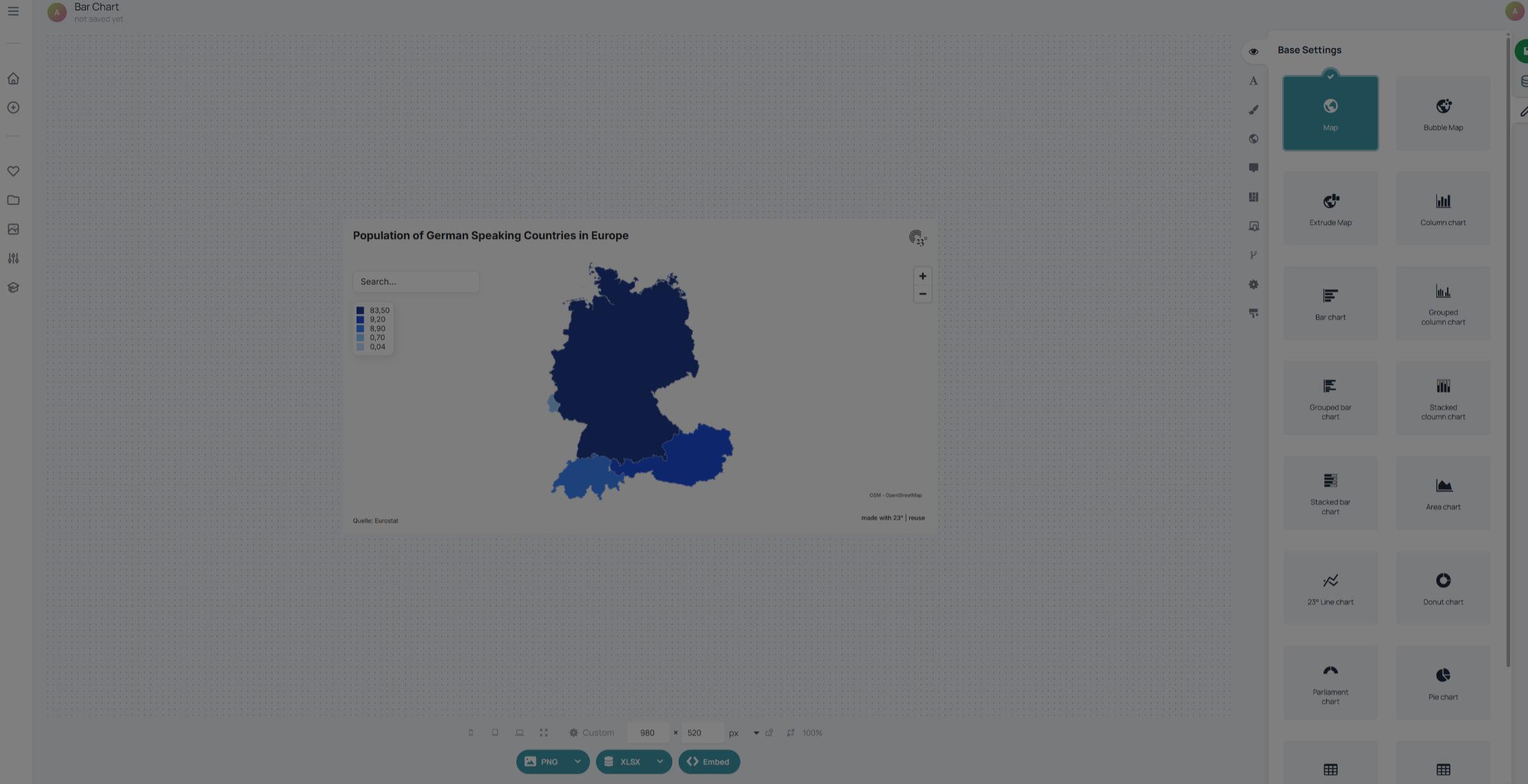
You have successfully changed the column type from text to geographic format in 23degrees. Look out for more map and geography based to tutorials.