Column Types Explained: Geo
In this tutorial I’m quickly going to explain what Geo columns are used for and which extra options you have with them – not just for creating maps, but also for powerful filtering in other chart types.
You’ll most likely encounter Geo columns when working with maps. At first glance they look like normal text labels, but they’re much more powerful because they understand regions and can be linked to map shapes.
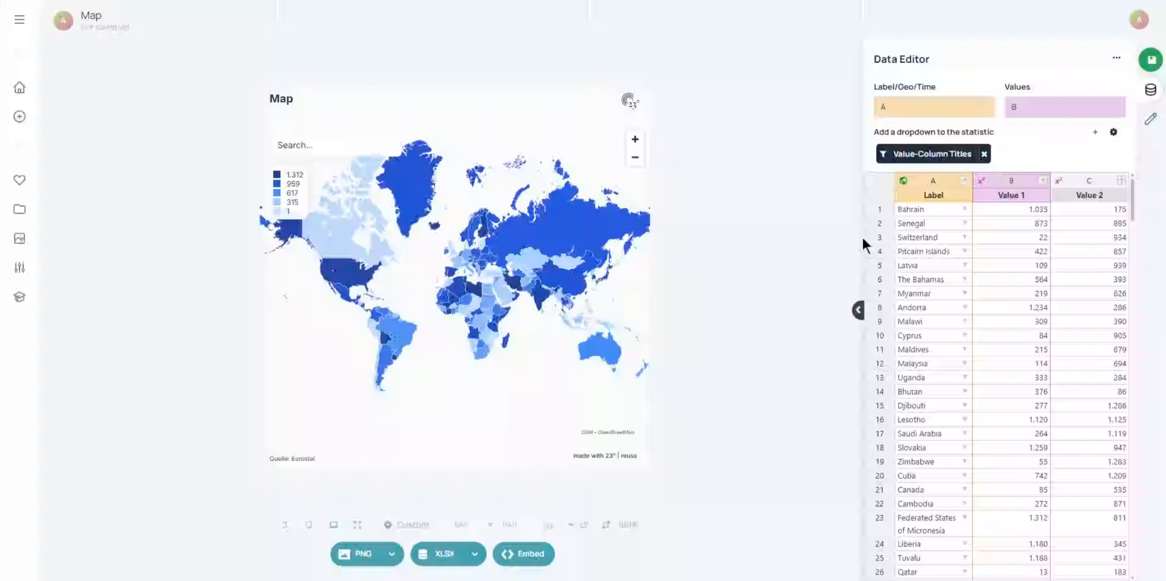
You can identify a Geo column by the green globe icon in the column header. That tells you the labels in this column can be matched to geographic regions in a specific map layer.
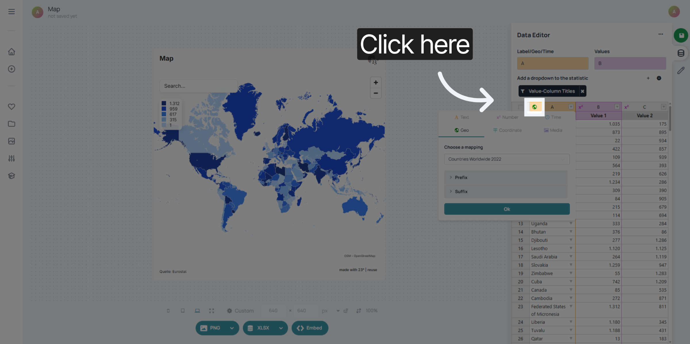
A Geo column has labels that are mapped to shapes of a specific geo layer. They always come in pairs: every recognised label in your dataset has a dedicated shape on the map. If the label isn’t recognised, it can’t be drawn.
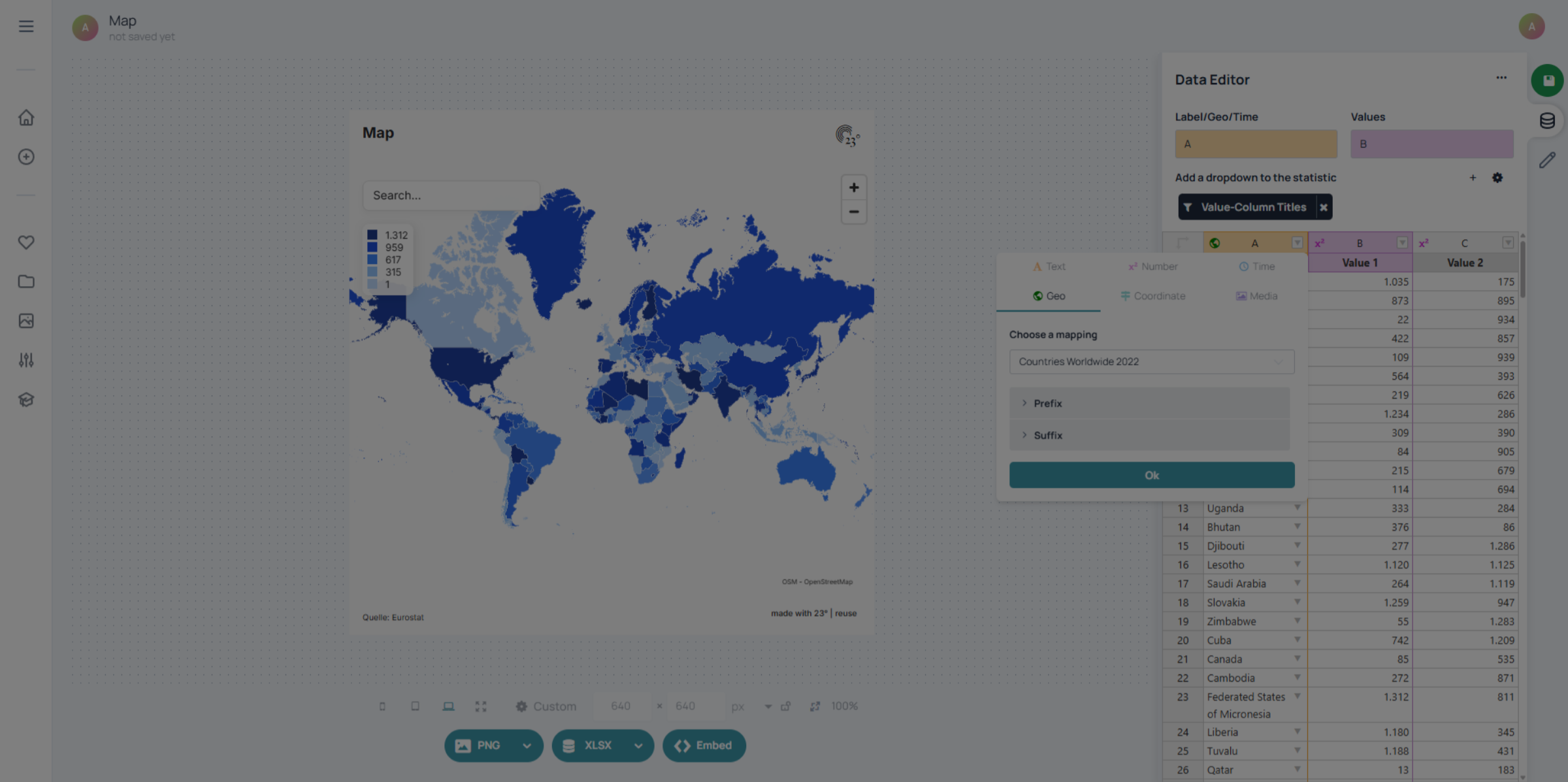
Geo columns have more options than plain text labels. Click the arrow button on the column
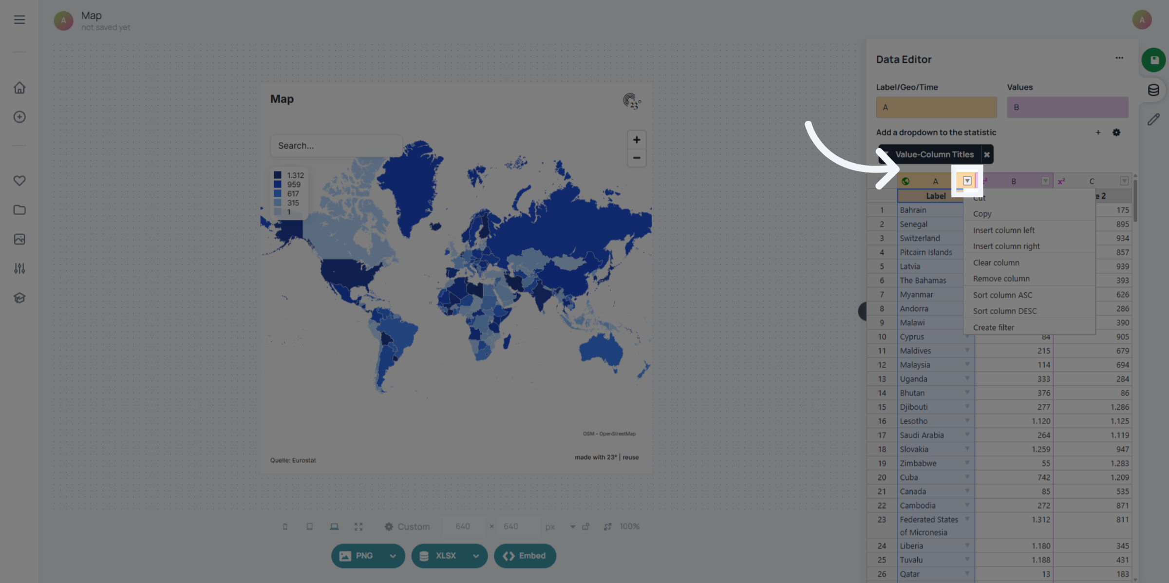
and create a filter. This opens up region-based filtering options you can use to control what appears in your visualisations.
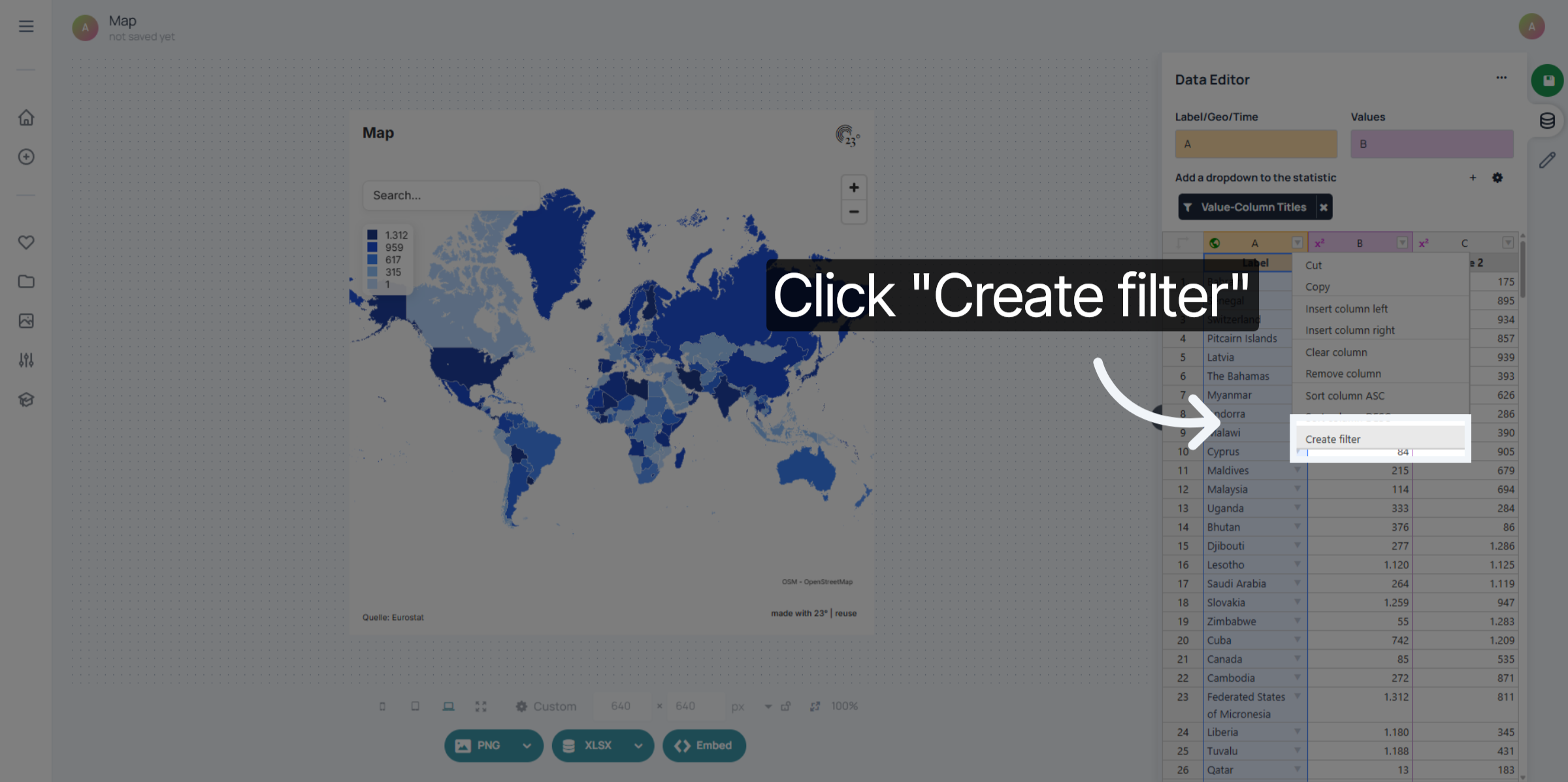
With the region filter, you can select different regions to filter your maps by. 23degrees offers hundreds of geo filters – from simple continents to economic and military alliances like the EU, NATO, OPEC, African Union and many more.
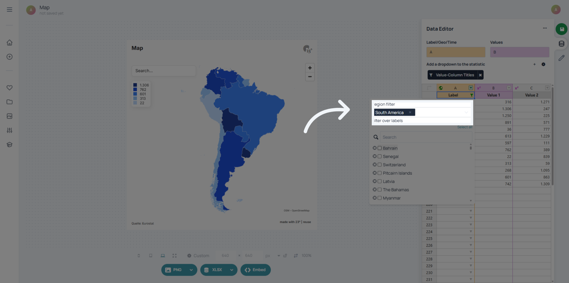
You can also add individual countries or custom selections.
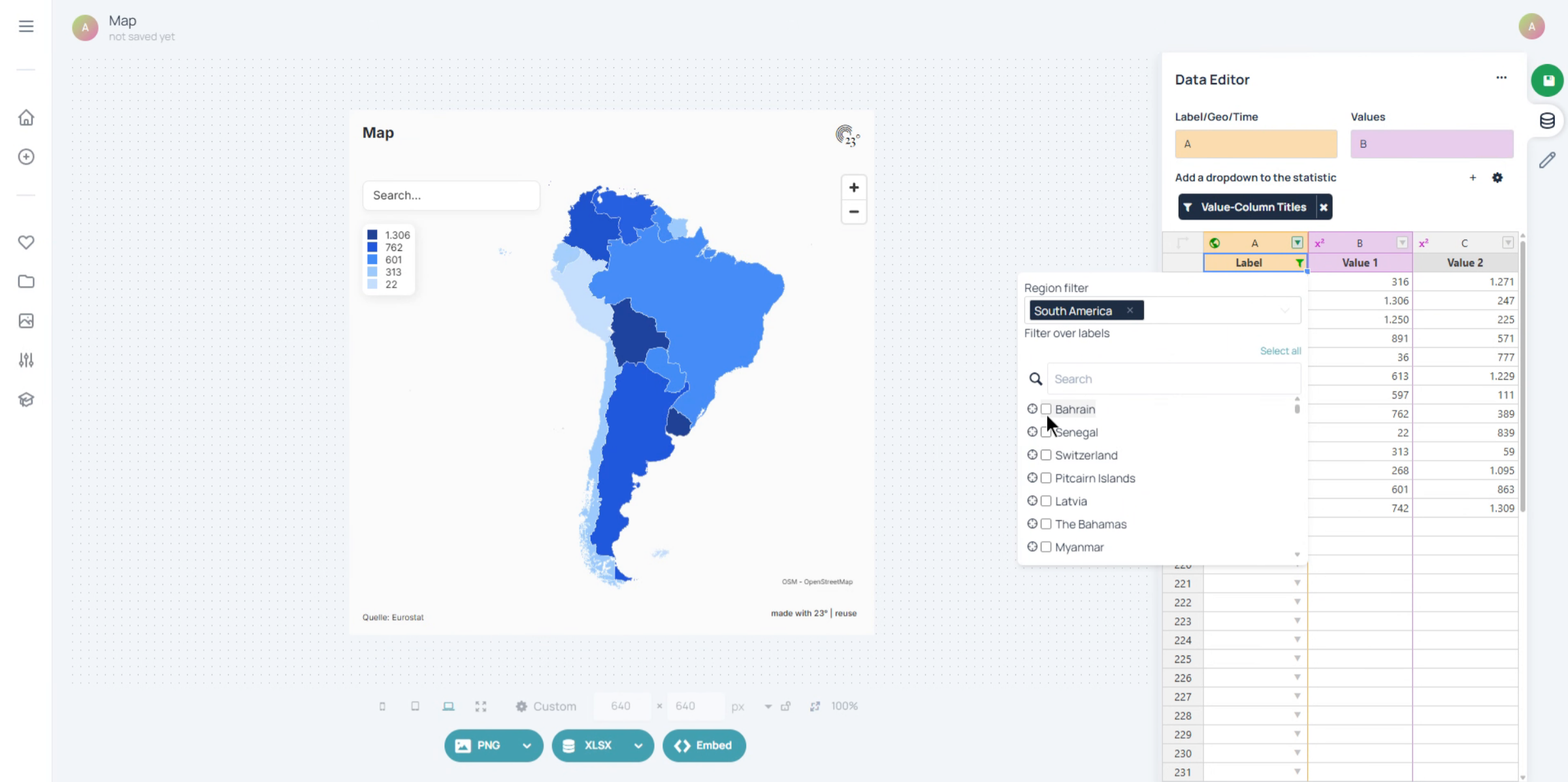
You can add prefixes and suffixes to your Geo labels, just like with text columns.
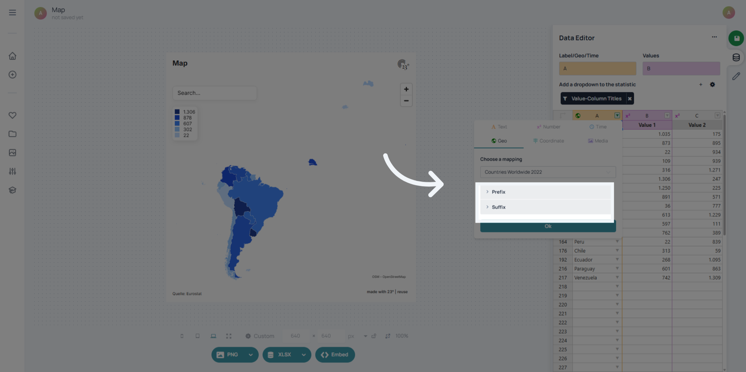
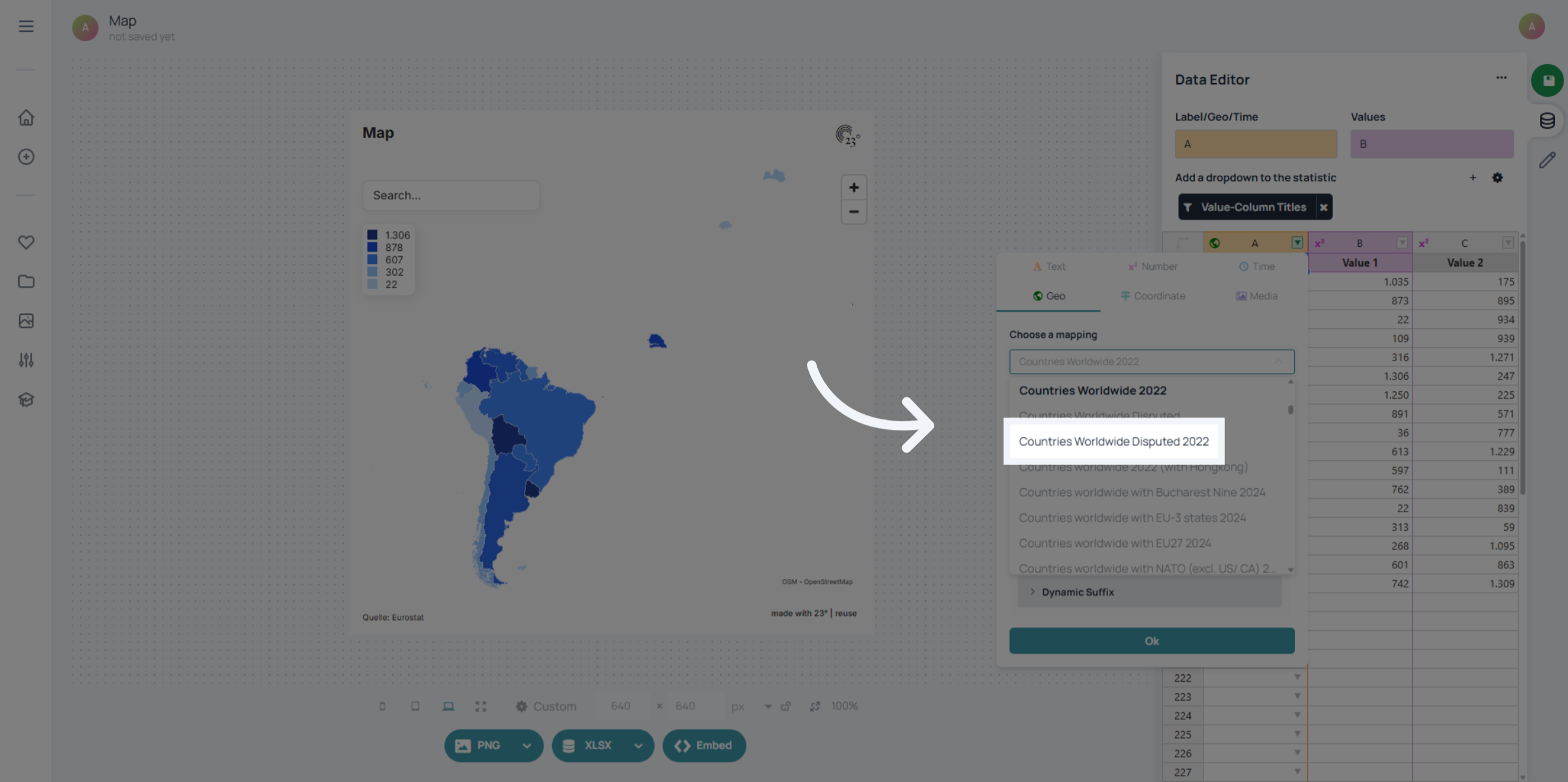
You can also switch layers – but keep in mind: your dataset labels must have a matching region in the new layer. If they don’t, the shapes can’t be matched and the map will appear empty.
Geo columns are not only for maps. If you have a dataset with regions and want to create a bar chart or column chart, you can still use the Geo column. This way, you get all the geo-based filtering options even in non-map visualisations.