Configure Tooltips in 23degrees
This tutorial guides you through configuring tooltips within charts in the 23degrees application.
You will learn how to customize tooltip content and appearance to enhance user experience.
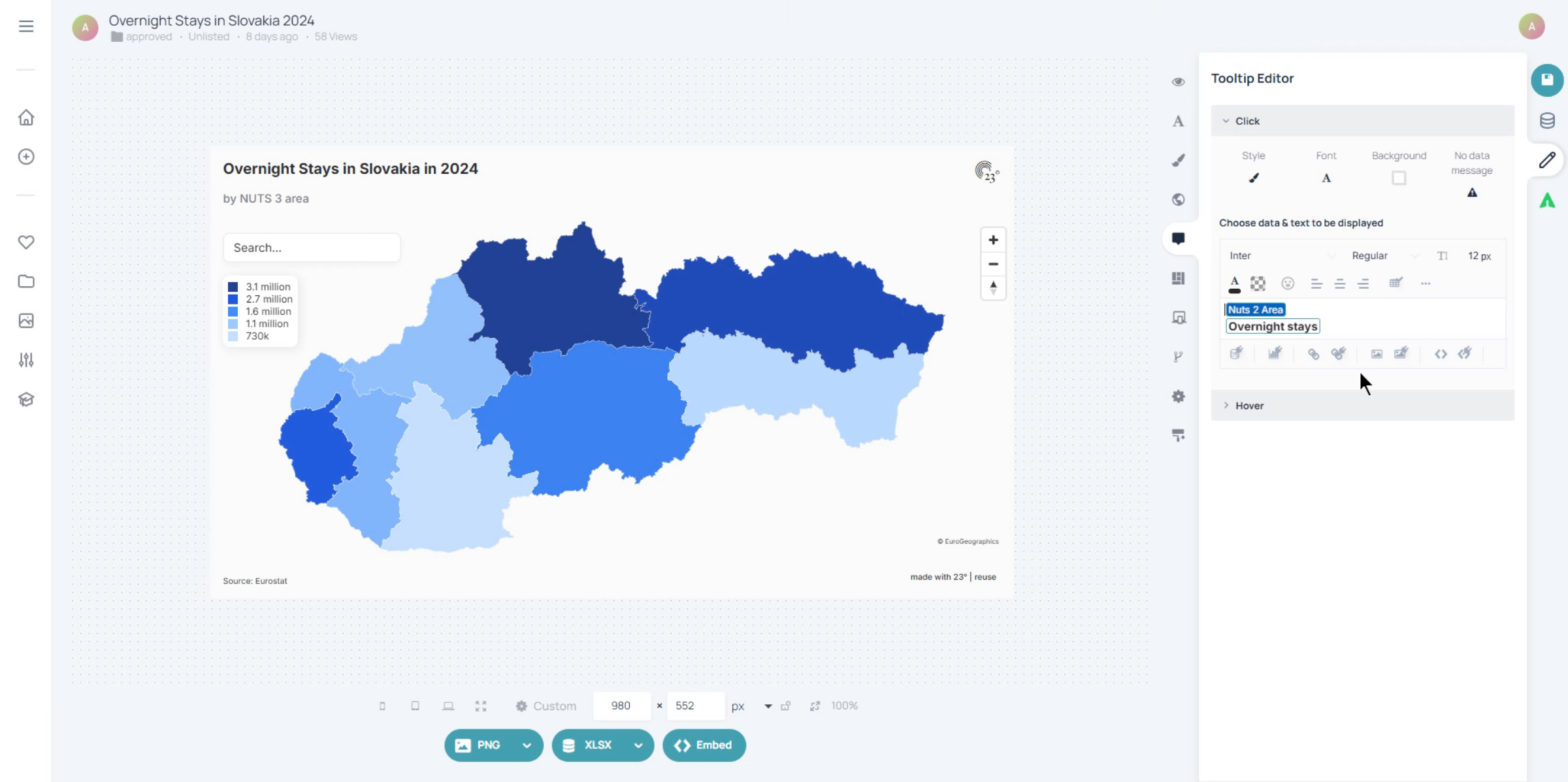
To access the tooltip settings click here
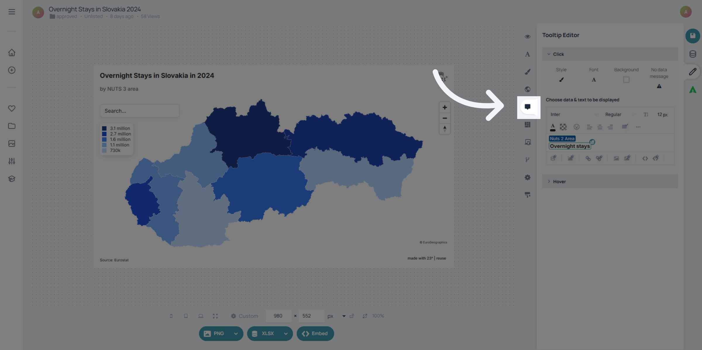
There is two ways how you can display or style a tooltip. There is the standard on click tooltip, that opens when clicking on a region or a bar in chart. And there is the hover tooltip which opens up when hovering over the intended area.
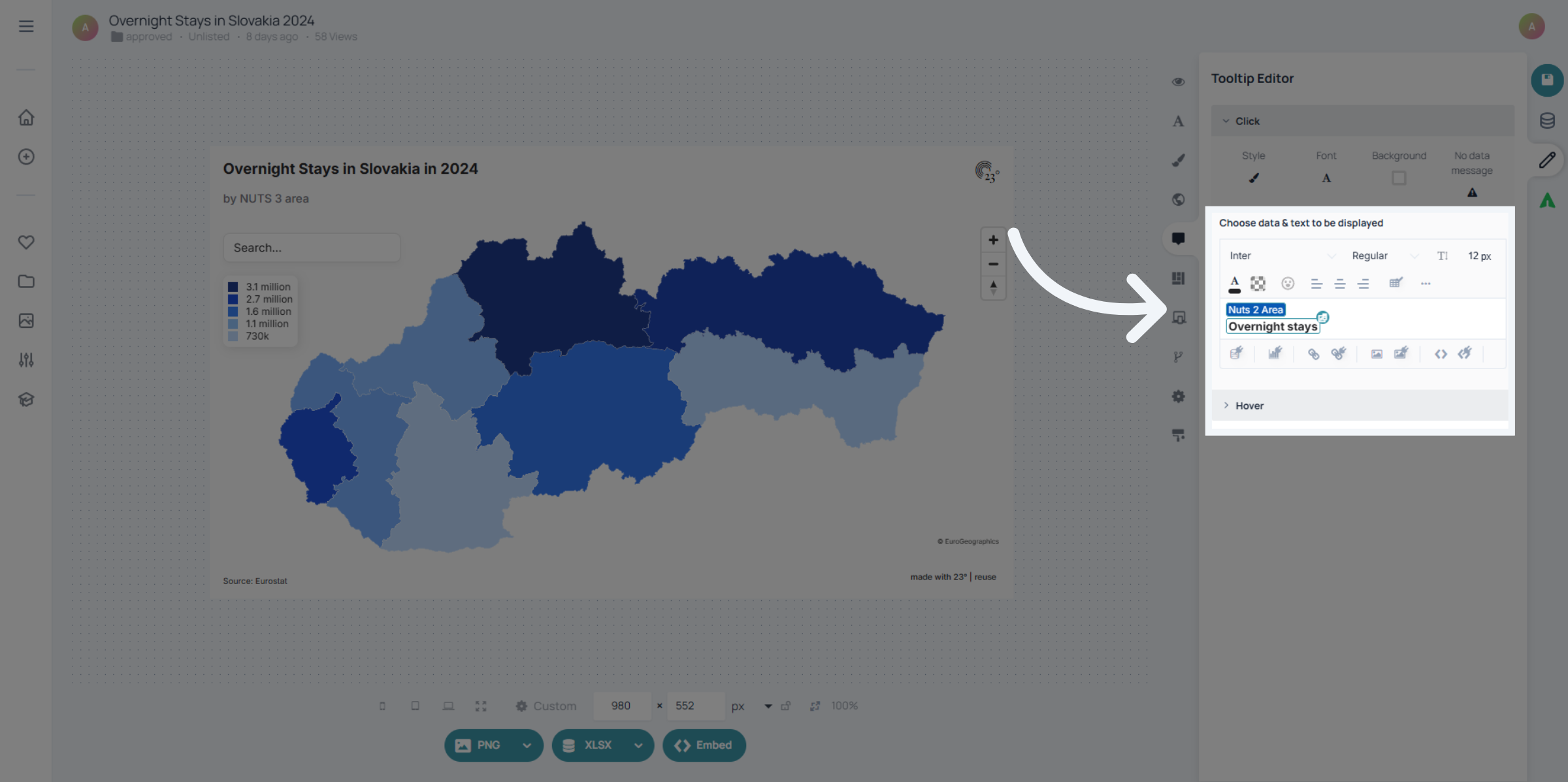
In each tooltip you can write text freely and also add dynamic text or values from your dataset by clicking here.
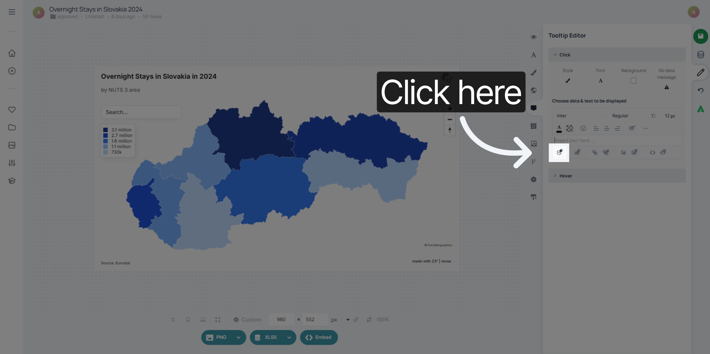
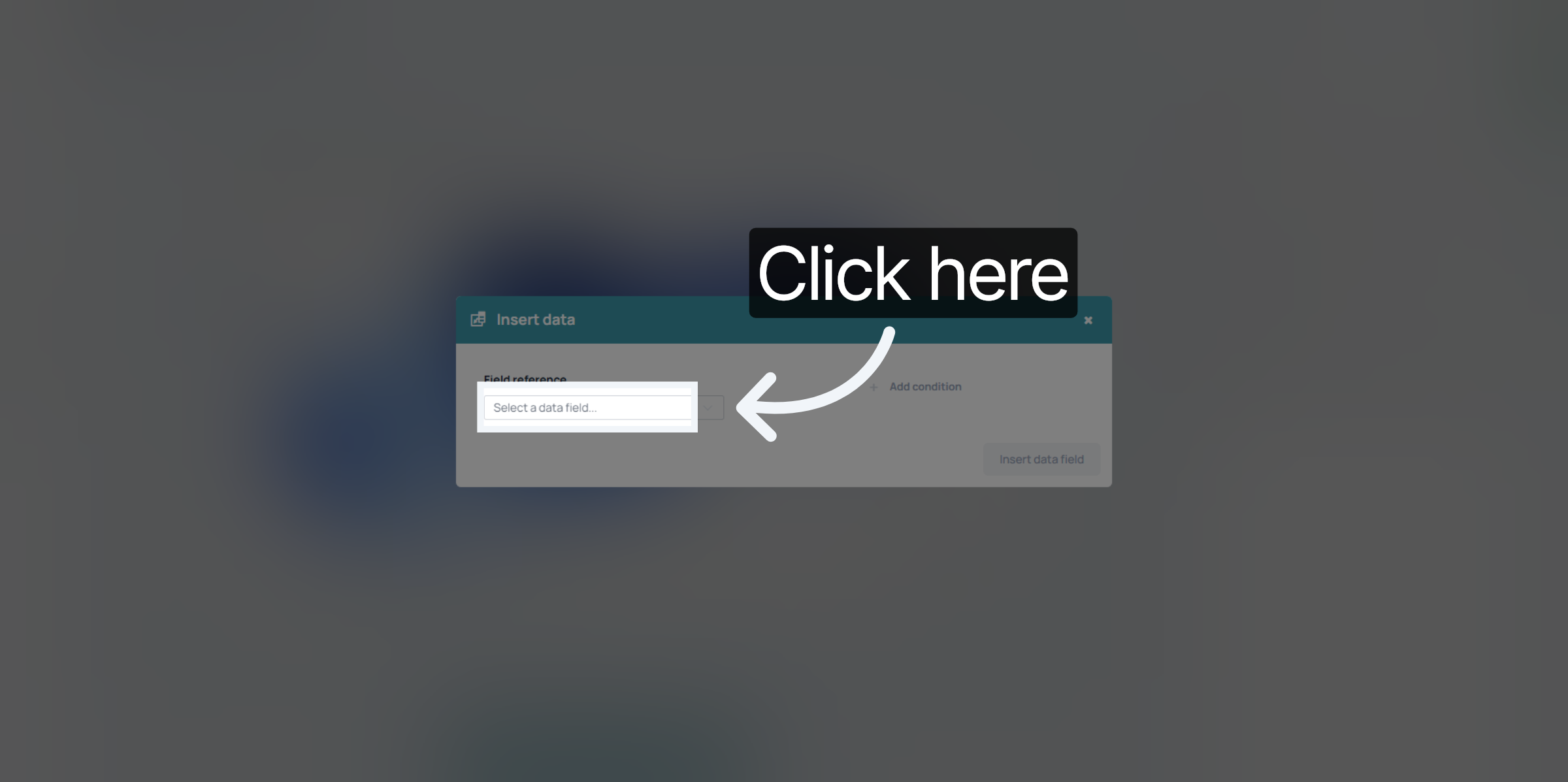
Click here to select a datafield you want to select from your dataset.
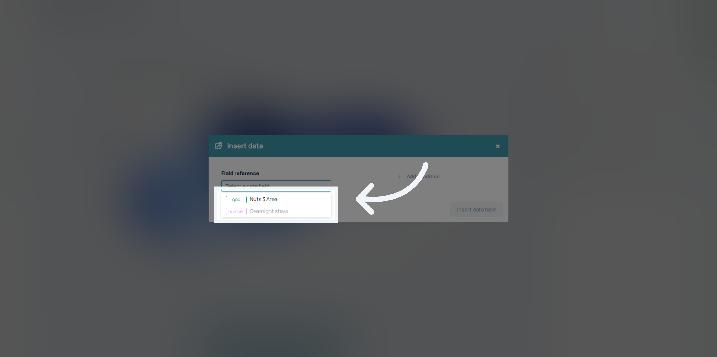
In this case we have a geography label and a value that we can display. we want to add them both eventually to display the regions name and the number of touristic overnight stays per region.
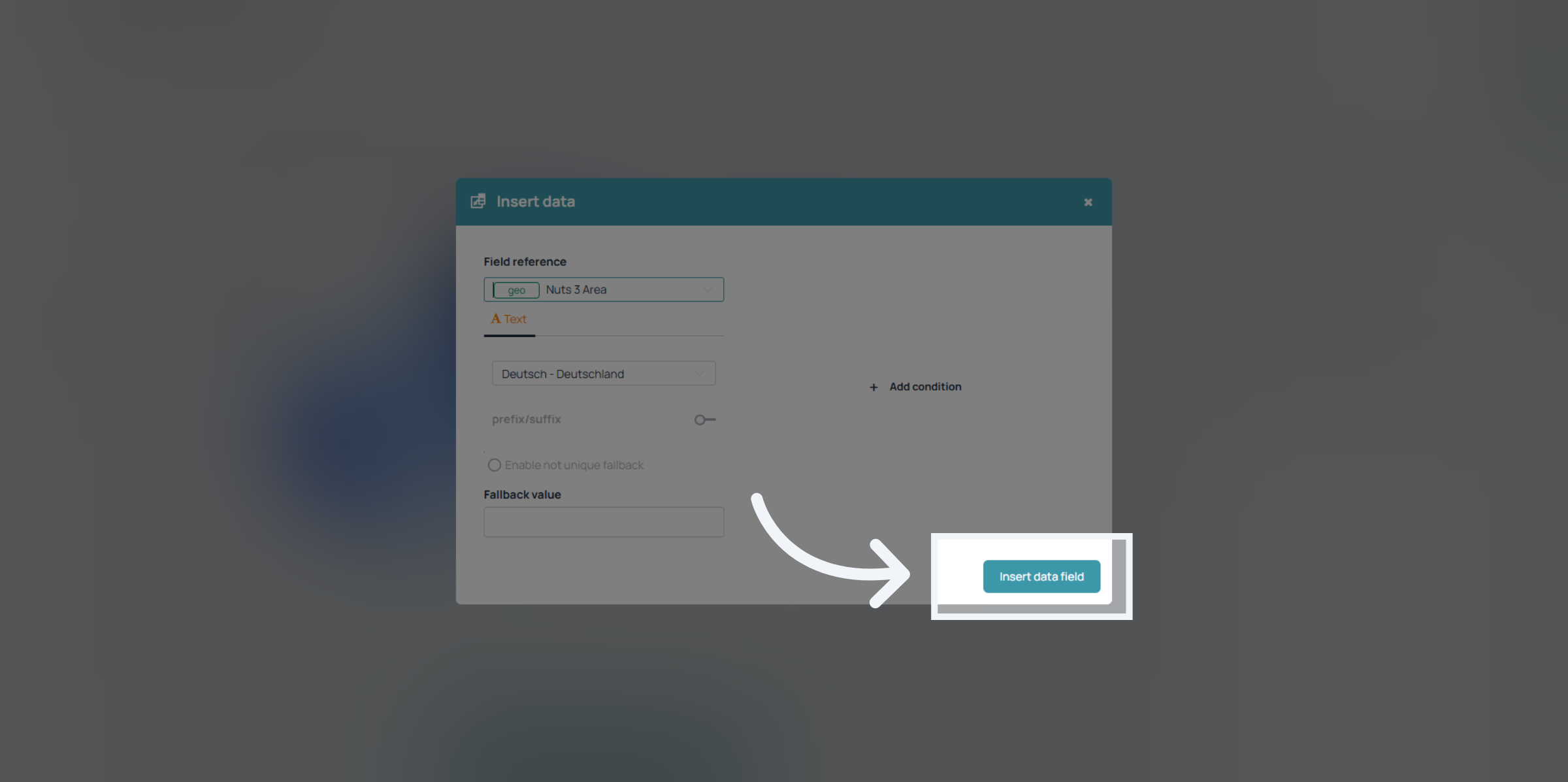
Click "Insert data field" to add the dynamic data elements into the tooltip content.
The same thing you can do for the hover tooltip. Just open the options by clicking on the hover bar.
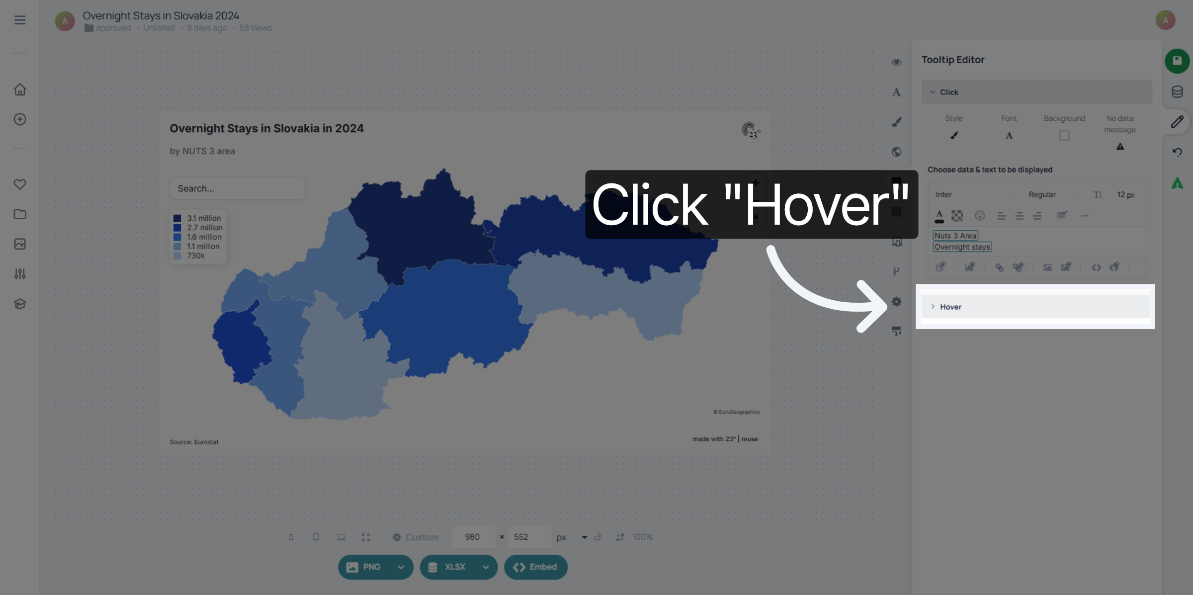
The Text Elements of the tooltip can be changed just as any other text editor in 23degrees. If you want the values for instance bold and more prominent than the geo label click on the datafield and give the font a different size and weight.
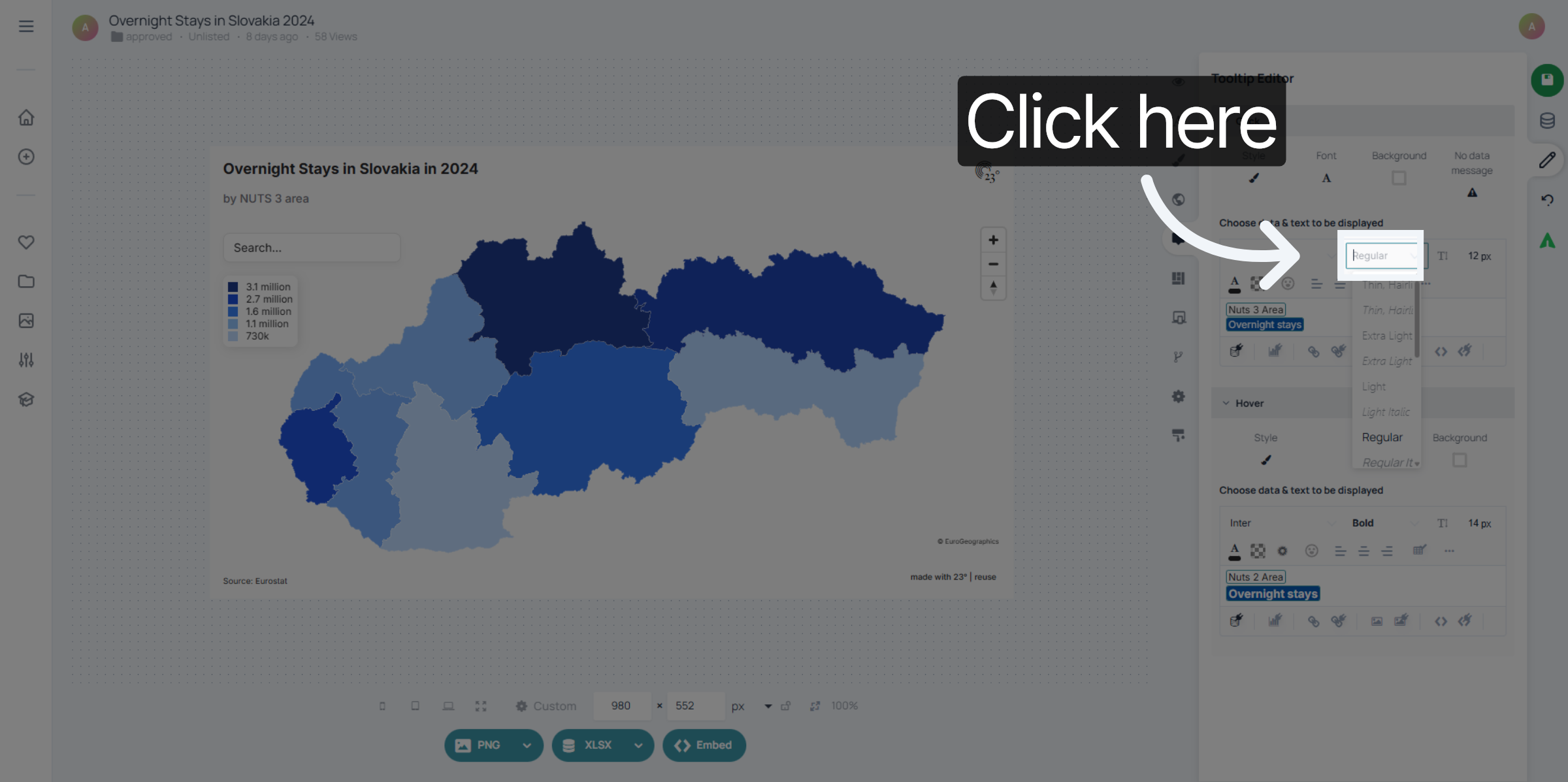
You can style the click and hover tooltip the same, only style one or have both of them display different things. But keep in mind: Hover tooltips only work on desktop devices. For mobil use the click tooltip is your best friend.
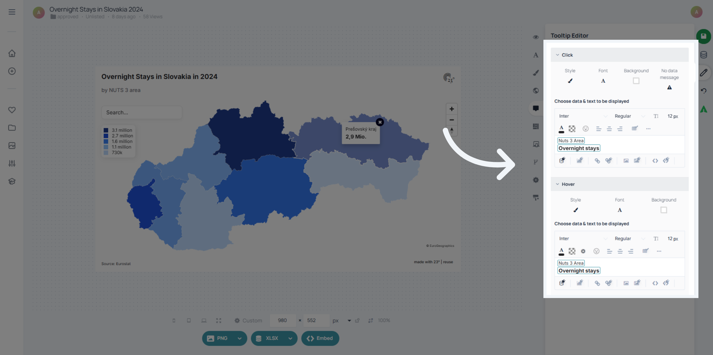
And that's already it!
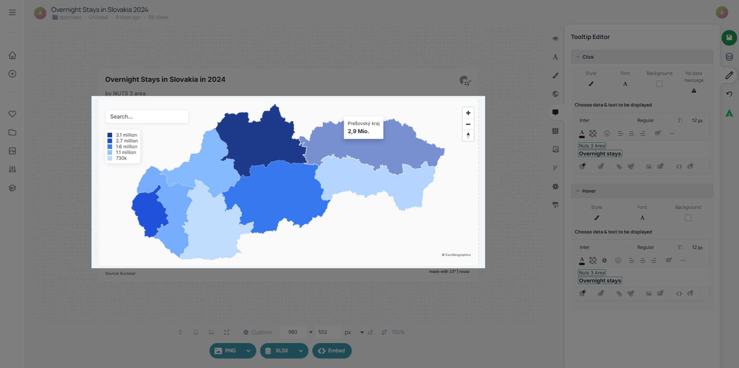
You have successfully configured tooltips in the 23degrees platform by selecting data categories, customizing content, and adjusting appearance settings. This setup enhances data presentation and user interaction with your visualizations.